Google has introduced a new look to Gmail that has tons of reminiscence from Google+.
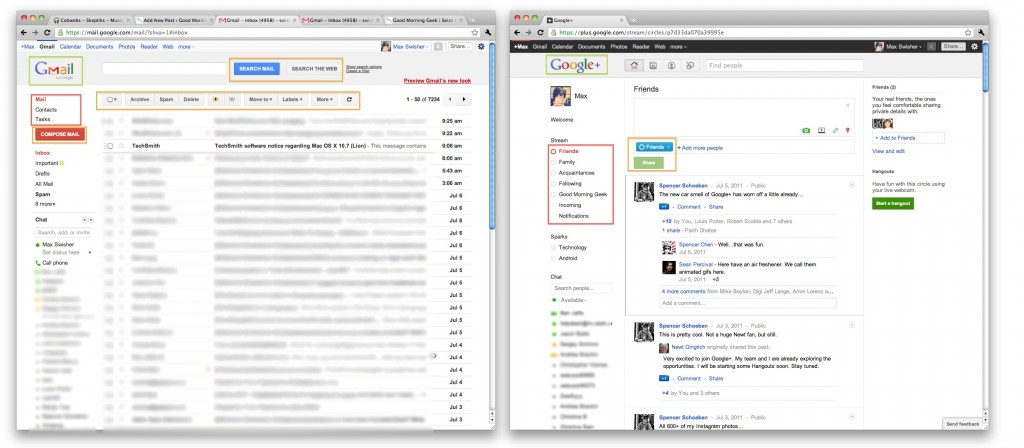
Lets compare. Click the below image to open the screenshots in a new window.
If you look at the above screenshots, the first thing you may notice would be the sidebar. In both Gmail’s “Labels” and Google+’s “Circles”, you see that the selected item is highlighted in orange, both in the same font (highlighted in red).
Another similarity would be the buttons. Look at the “Share” button in Google+, then the “Search” and “Compose Mail” buttons in Gmail. You’ll notice that they are the same style and size (highlighted orange).
Last (and frankly least) the logos look the same (highlighted green).
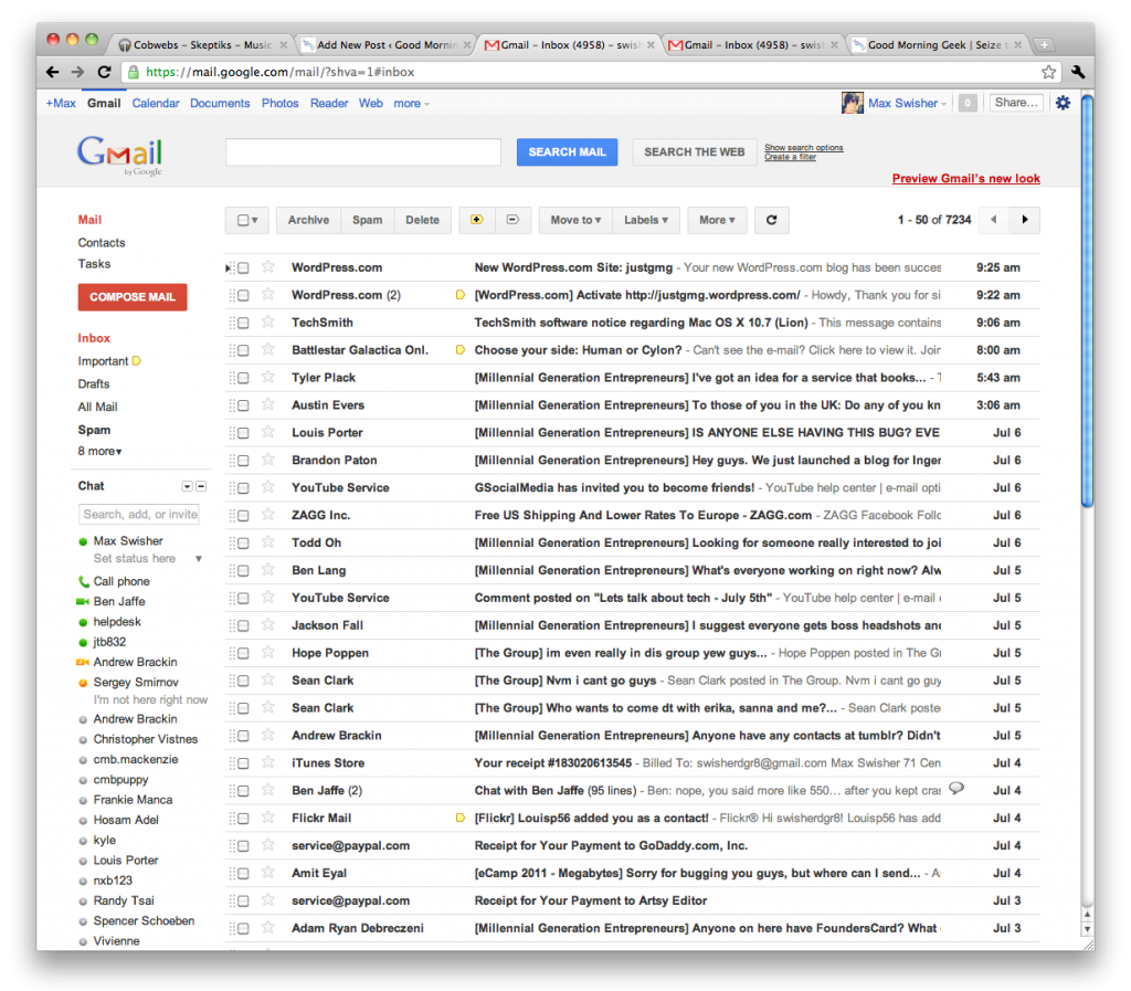
Now lets compare the new Gmail to the old Gmail. Click the below screenshot to open it in a new window.
The buttons are different, and have no similarities to Google+. The selected label is simply bolded, where in the new theme they are colored orange in addition (highlighted red). In the new Gmail, messages are also farther apart (highlighted orange). I guess it gives a cleaner look, and it’s a little less dense on the eyes. In old Gmail, the buttons are less clean than in the new Gmail’s (highlighted green).
I know these are just interface changes, but it shows that Google is trying to really uniform everything around Google+ – even the top bar anywhere on google has been themed dark with orange highlights. Google+ is more than a social network – it is becoming a social Google.


