Google Kills Free Apps for Business

Google has announced in a blog post that they are disposing of the free version of Google Apps.

For those of you who don’t know about Google Apps, it is essentially the suite of Google Applications (Gmail, Calendar, Contacts, Docs/Drive, etc.) but tailored to fit a custom domain/business. I personally use Google Apps for maxswisher.com, and I must say – it’s great. I love having the spam filtering, organization, and amazing reliability of Gmail under my own custom domain. It’s a wonderful system which I love dearly.

And thankfully, this update to the pricing plans won’t affect any current users – meaning that I won’t have to say goodbye to my beloved account.

For new Google Apps signups, the cost will be that of Google Apps for Business – $50/year per user. This is fairly pricey for an individual, but the services were created for businesses in the first place.

Although I don’t like it, I believe that this is a very sensible decision for Google. Think about it from Google’s point of view: Here are businesses paying $50/year for a full customizable suite of high-quality business applications, and there’s individuals creating accounts just so they can have gmail at their own domain (I am guilty of this). As quoted from Google’s blog post:

With focus we’ll be able to do even more for our business customers. We’re excited about the opportunity to push Google Apps further so our customers can do what matters most to them…

 

Google introduces new look to Gmail, inspired by Google+

Google has introduced a new look to Gmail that has tons of reminiscence from Google+.

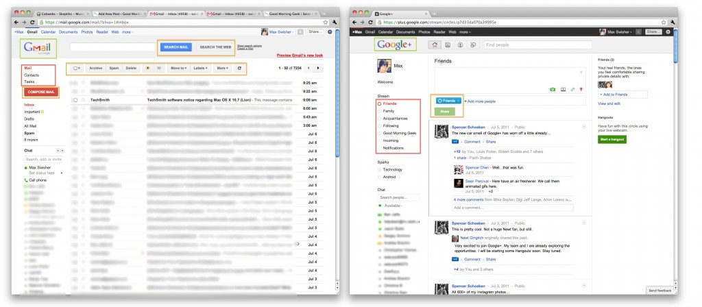
Lets compare. Click the below image to open the screenshots in a new window.

If you look at the above screenshots, the first thing you may notice would be the sidebar. In both Gmail’s “Labels” and Google+’s “Circles”, you see that the selected item is highlighted in orange, both in the same font (highlighted in red).

Another similarity would be the buttons. Look at the “Share” button in Google+, then the “Search” and “Compose Mail” buttons in Gmail. You’ll notice that they are the same style and size (highlighted orange).

Last (and frankly least) the logos look the same (highlighted green).

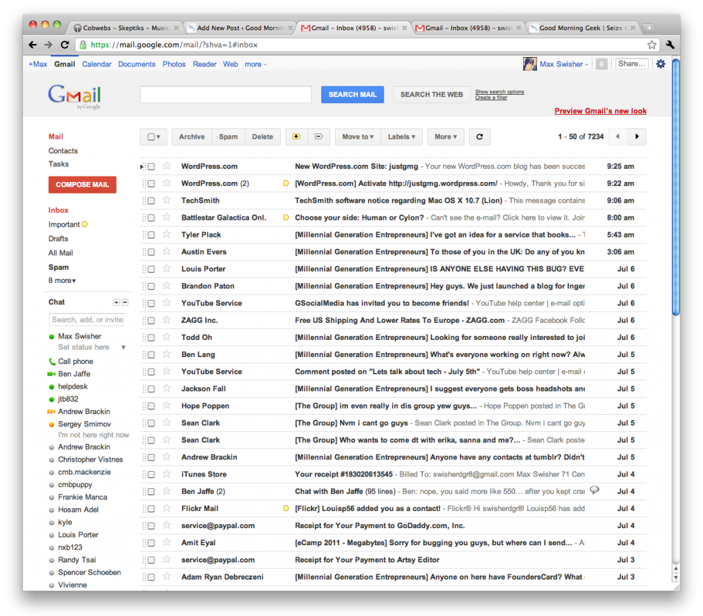
Now lets compare the new Gmail to the old Gmail. Click the below screenshot to open it in a new window.

The buttons are different, and have no similarities to Google+. The selected label is simply bolded, where in the new theme they are colored orange in addition (highlighted red). In the new Gmail, messages are also farther apart (highlighted orange). I guess it gives a cleaner look, and it’s a little less dense on the eyes. In old Gmail, the buttons are less clean than in the new Gmail’s (highlighted green).

I know these are just interface changes, but it shows that Google is trying to really uniform everything around Google+ – even the top bar anywhere on google has been themed dark with orange highlights. Google+ is more than a social network – it is becoming a social Google.