@onowa (A.K.A. Carlos Rodela) gave me a shoutout on his show Rad on the Web. Thanks a lot Carlos!
Monthly Archives: November 2010
Create a spanning wallpaper
So I have expanded my setup recently to six screens, and one of the fun things about having a lot of screens is that you can make a wallpaper span across all of them. There are apps that do that, but they can’t span across different computers. Here’s to do it the manual way.
To do this we will take a single large wallpaper and split it up into individual pictures for wallpapers for each screen that you are spanning across.
1. Pick a picture
The wallpaper doesn’t have to be too large, but one that was made to fit a very large monitor always goes best. I’m using an image that is 1920 pixels wide.
2. Find screen resolutions
This is an extremely important step in the process so you know the proportional size of each chunk of your source image. The resolution can be found in the display preferences of every computer (or screen resolution preferences). Here’s the resolution of all of my screens:

Once you have that all worked out, time to break out photoshop.
3. Cut your pictures
Warning you: this step takes a little while.
Before you can start cutting your photos, you need to know the proportions of your screens. This can be done with a good old fraction simplifier.
Just visit this site and put in your width into the top of the fraction and the height into the bottom. Then select to have the result as an improper fraction. You may want to name each screen screen 1, screen 2, and so on. Find the result of each screen resolution.
Then, open your source picture in photoshop. Select the rectangular marquee tool and where it says style select fixed ratio. Where it says width and height put in the top and bottom of the fraction you got out of the simplifier.
I’m going to start with my first screen which is 1280X1024, which according to the magic simplifier comes down to 5/4. So I am going to put 5 and 4 into photoshop, then start to select what you would like to be for your first screen. Because my first screen is the top left, I want to select in the top left of the picture.

Once you have the selection, create a new document called wall1 and make it the size of your first monitor.
So now you need to go back to where you made your selection and hit copy, Then, take your paintbrush tool and color over it. This is so that when you make selections in the future you know where your screen will be.

Then, go into that new blank document you created and paste it. Use the free transform tool and move the edges of the pasted selection to the edges of the canvas. Save and repeat for every single one of your screens.

Done yet?
If so, you should have a bunch of files named wallX.psd (which you should also convert to JPG) and a bunch of black squares on your source file.
Now you have to distribute those files to the appropriate computers. You may have to use a USB stick but I have FTP and a web server so that makes it easy.
Once you have all of the wallpapers set your result may vary depending on the spacing or irregularity of your monitors. With mine you can still see it but not that well.
iPod Nano
The iPod nano hasn’t felt much love from me so far. Lets get into the details.
Design
The iPod Nano features a very small and portable design. They tiny little screen has a black bezel that goes across the front of the screen. Apple decided not to totally flatten it out and give it edge to edge glass (which would have been a nice touch, would it have killed you to do that apple?). They turned the screen into one of touch, and makes it very difficult to use if you have sausage fingers. One of my main complaints would be the font size. I have pretty good vision and it hurts my eyes to look at the screen for too long. The iPod Nano has three buttons on it: Volume up, volume down, and lock (Apple is slowly doing away with the hold switch). The iPod Nano has a clip on the back which is an intersting addition. Ads show the nano being clipped onto shirts, bags, pockets, etc. The problem I have with this whole clippy intention is that the way they want you to wear it displays album artwork (or pedometer stats or whatever else for that matter) to everyone around you. I know it’s nice to show off what $1.29 music you were able to afford, but I really don’t need to know what music you are listening to. The nano comes in grey, black, blue, green, yellow, pink, and red.
Interface
 The iPod nano has it’s own software which isn’t iOS but has a very similar interface. As you can tell by the picture on the left is has icons and pages and a wallpaper, but it doesn’t have any apps. You can rearrange all of the icons around on the home screen. Instead of having an app for all music, there are different icons on the home screen for songs, artists, playlists, now playing, genres, etc. The interface inside of the apps is like a shrunken down version of that from iOS. One interesting feature would be that the screen is able to rotate to fit whichever way you have the iPod clipped, but to do this you have to put two fingers on the screen and spin them around whichever way you want to have the screen oriented. It’s a bit disappointing that they couldn’t have at least thrown in an accelerometer to take care of this.
Sound Quality
I was personally a little disappointed with the quality of sound on this device. I found it to lack some of the higher ends, and while it still delivers full sound doesn’t pack that higher punch that other iPods do.
Value
The iPod nano goes for $149 for the 8GB version or $17o for the 16GB version. Personally, I think it’s a little bit of a rip off as the iPod shuffle goes for $50, and the nano is a shuffle with an FM tuner and a touchscreen. Personally, I think that this was a bad decision by apple as a touch screen interface on such a small device is very difficult to navigate, and believe it or not there are still people who just want to listen to music but definitely like having a screen and really don’t need 16o GB of storage space.
Teleport
 Many people I know have multiple Macs. The most standard multi-mac setup would be one desktop (usually a Mac Mini) and a laptop (Macbook, Pro, or Air). This is usually so that one can have power and still be mobile. But when it comes time to sit down and do some work, it might be useful to have two screens (studies show a dramatic increase in productivity with more screen real estate). But one problem faced is that with multiple computers comes multiple mice/keyboards. Well, if you’re all macs, then there’s a solution.
Teleport is a free and easy way so that you can use one keyboard/mouse and have it span across multiple computers (so you don’t have to move your hands to control a different computer). It’s extremely simple to use.
To get it all working, all you have to do is download teleport. Teleport is a Mac Preference pane (.prefpane) so to configure teleport you open system preferences and click on teleport (under other). Here you can configure settings and arrange the screens. NOTE: Make sure that both Enable Teleport and share this computer are both checked.
In the preference pane you can configure things like pasteboard sync and choose if you want to only switch to the other computer when you are holding a specific key down.
the rest is pretty simple. Just move your mouse across the edge of the screen and it should show up on the screen of the other computer. Whichever computer your mouse is on will be the computer that the keyboard affects. However, the volume keys don’t work across Teleport (neither does multitouch except for scrolling).
Teleport is a great free app that works and does what it should quite nicely. There are some problems when your mouse is on a client computer screen and the client computer loses internet connection. It takes quite a while for your mouse to reappear on your main computer. But the convenience of this application overcomes this setback.
BOINC
![]() BOINC stands for Berkely Open Infrastructure for Network Computing. And I want to appreciate what they are doing with their Distributed Computing platform.
BOINC stands for Berkely Open Infrastructure for Network Computing. And I want to appreciate what they are doing with their Distributed Computing platform.
Basically, you download an app to your computer. And when your computer is not in use, all of it’s power (or as much as possible) goes over the internet to berkely so essentially they have a supercomputer of all of these other computers (hence distributed) to go to cure diseases, detect pulsars, and other scientific stuff. It’s an easy way to donate something that could be extremely useful to the cure. The help of the world. So many other scientific things that will get us farther along and allow us to make discoveries of all sorts.
I think that other than being really cool, the BOINC distributed computing platform is an amazing idea. So many people are away from their computers and they leave the potential of power just sitting there. It’s like donating your computer to UC Berkeley for scientific research, but only for the time when you aren’t there.
This is great if you have a LOT of extra computers around you can join this and put those lazy things to work. I read the idea and I just thought to myself. Genius.
Now what’s really cool is that you can actually select which cause you want your power to go to. There are so many categories (all of which support various operating systems) for you to benefit to.
Unfortunately to get it all working it’s pretty simple but can get kinda complicated.
First, click here to download boinc.
Then click here to go see which things you can benefit to. Then find one that has a cause you would like to benefit too. Then, in boinc, click add project. On the page where you found the cause, look at the name in the left-most column. Find that name in the window of boinc and select it. It will connect to the project then ask you to setup an account and stuff like that. Once you are done with that, boinc will start to download work from the server. One thing you may want to do is open the preferences and select some limits on how much power of your computer it is allowed to use. I made it so that it would only do work after the computer was idle for 1 minute, because I want all of the power of my computer when I’m using it but when I’m not I don’t find a point in letting it sit there useless. I also only allowed it to use 2GB of space on my disk, as I don’t want too much disk space being sucked up by this cause. I also told it to use only 70% of my computer’s processor as I don’t want my computer to overheat either.
I think that this is a great and free way for people to contribute to causes without having to use money. Enjoy 🙂
3as1ly Charg3 Cr3d1t Card5
You are a babysitter.
You are a bartender.
You are a photographer.
You made a bet with a friend over a football game.
All of these require payments. And while yes, you could take cash, sometimes it’s just easier with a credit card, as the money goes straight from their account to your account and you don’t have to deal with any of this green paper stuff.
Usually, you have to have one of those little thingies that they have at supermarkets with a single-purposed computer just for making a bill and accepting a credit card. But now, you can be on your way to accepting credit cards for a very small amount.
The key to this whole task is Square.
Square is completely free and consists of two parts: An app for your iPhone, android, or iPad, and the physical Square card reader.
Amazingly, the square card reader works with all of these. One model for android AND iPhone AND iPad. How you say? This picture should sum pretty much everything up.

So in case you didn’t figure it all out from that picture, basically the square is a little plastic thing that you plug into the headphone jack that has a slot that you can slide a credit card though. In the app, you can select how much you want to charge.
Now after you have put in an amount and swiped the card, you have to sign to authorize it. Of course that would usually be done with first a pen and paper, but now you can with a stylus on one of those thingamajigs in supermarkets. With square, you are supposed to use your finger on the touchscreen, but that can be hard as we are used to having pens. So that’s why in addition to your app and a reader, you need a pogo sketch to go along with it.

That should pretty much explain it.
Now after you are done with all of this swiping and signing and lolly-gagging, its time to print a receipt. I don’t think so. Instead, you can have the receipt emailed to a specified email address. cool, eh?
So wherever you are, at a wedding or the house of a small child, you can always accept credit cards and let people sign and get their receipts without ever seeing a piece of paper.
Alfred
 A wonderful little app with the worst name they could come up with.
Alfred is a Spotlight Alternative. It is similar to quicksilver, but is quite a bit simpler.
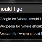
Basically, it is a plain text box that opens on a key command. you can type to search through your hard drive, but if there are no files then you can choose to search through google, wikipedia, or even amazon.
In addition to searching your hard drive alfred can search numerous things.
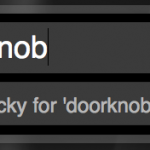
For example, you can type “lucky doorknob” an it will open the first google result for a search of doorknob.
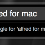
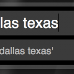
You can also do things like type in a URL and it will open in your web browser. In the screenshots is a list of some of the functions included with the app. You can also create your own which comes in handy if your favorite search engine doesn’t come with Alfred by default.
Now although those functions are useful, it prevails over spotlight mostly because if it’s speed. Everything happens faster for some reason, but let me just say, I like it.
Alfred is free and highly customizable when it comes to interface. Download it from alfredapp.com.
Screenshots:
Android App Inventor
![]() So many of us have absolutely no idea how to code for Android. Heck, barely half of us know that Android is coded in Java!
So many of us have absolutely no idea how to code for Android. Heck, barely half of us know that Android is coded in Java!
But Google decided to be nice and create a graphical interface to create your apps with no knowledge of coding.
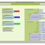
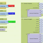
The app inventor consists of two main parts: The designer and the blocks editor.
The designer is all about the graphical interface of the app. Unfortunately, it only allows you to create a single front screen, so you can’t go into sub-pages. You can add elements and give them text and make them look how you want them too etc. The designer is actually all in a web browser.
The second part is the Blocks editor. Here is where you edit the functions off all of the components you added in the design view. You put different functions (blocks) together like puzzle pieces to add functionality to things. Unfortunately the documentation isn’t very helpful when trying to figure out how exactly to use these blocks, but I guess it’s possible to learn. The blocks editor is a java application that you can download by clicking a button in the designer.
Once you have the apps downloaded, you can enable USB debugging on the phone and plug it into the computer. Then, in the blocks editor you can connect to the phone with a button. Once you are connected to the phone the changes that you make in the designer and blocks editor will appear on the phone in real-time.
Once you have your app built, you can do a variety of things: You can either download the app directly to your phone, save it to your computer, or use a barcode scanner on a phone and download the app from their servers over the internet.
Unfortunately, the apps you create cannot be put into the App Marketplace, and unfortunately they don’t notify you of this. So when you create an app in the app inventor and you want to put it in the android market so you pay to become a developer and all, you will be disappointed to see that your app will fail upon uploading. This is google’s fault, and at the moment there is no way around it.
Basically, the app inventor is a fun way to create simple apps, but don’t expect to be able to put your app into the Marketplace because GOOGLE HATES YOU.
Google App Inventor is only available as a private beta, so you can request an invite and cross your fingers.
Screenshots:
RockMelt
RockMelt is an attempt at making a new browser.
Unfortunately, I am not very happy with the results.
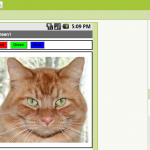
The big thing with this is social integration. There are two sidebars on each side. One shows online facebook friends that you can chat with and the other has buttons that pop up a small feed of facebook, twitter, or any other RSS feed.
This would be great, however I find it bordering a little bit from web to desktop. I feel that when I want to have a desktop social app, I get a desktop social app. When I want a web browser, I get a web browser. And often, social (facebook in particular) tends to be online. That’s fine with me. But it seems like putting a wordpress editor inside of a web browser (which is why I don’t like Flock). It’s nice how you can chat with your friends out of the blue without having facebook open but this tends to be quite a distraction seeing who’s online and everything without even clicking a button.
Other than that, RockMelt seems like a complete rip on chrome. It was built on chromium which explains why, but I feel like they don’t need 30 employees to implement a few APIs.
Indeed, rockmelt is painfully slow. If your cache is empty, Good Morning Geek takes about 15 seconds to load the background.
Unfortunately, I give this browser a 2 out of five. It has a great execution, but I feel like the idea behind it is a little bit out of place.
RockMelt is only available in private beta (you need an invite), so unfortunately you can’t try it out. However look at the gallery for some screenshots.
Uninstall an Android App
The simpler things are sometimes the hardest to figure out. Especially on a platform like Android.
Unfortunately, removing an app is quite the annoying process. But plenty of people don’t mind it so far.
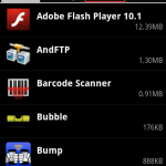
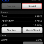
We want to uninstall the application Bump. Here’s what we do:
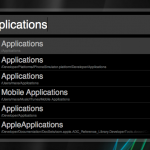
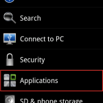
1. Go to the home screen and press menu and select settings.
2. Select applications.
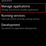
3. Select manage applications
4. Tap all applications at the top
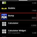
5. Find and select the app you want to uninstall (not alphabetical)
6. Tap Uninstall
7. Tap OK
If this was difficult to follow along, click through the gallery with screenshots for every step (in order, or course).
-
- Go to the home screen. Tap menu and select settings.
-
- Select applications
-
- select manage applications
-
- Tap all apps in the top right
-
- Select the app you want to uninstall
-
- Tap uninstall
-
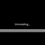
- The app will uninstall
-
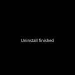
- Tap OK and you’re done!
Thunderbird
So I started to just plain get tired of the built in Mail app. It’s a nice app and all, but the main problem I had with it was that it didn’t really like my google apps account. It got the folders mixed up and it was just confusing.
So I ended up using webmail for the longest time. My webmail is Gmail powered, so it’s extremely nice as webmail goes.
But one day on the Millennial Generation Entrepreneurs group someone posted asking what everyone’s favorite mail client was. So a new one that came up was called Sparrow. I took the same interface as Tweetie, and I liked it except for the fact that it was quite slow. So I rediscovered an old favorite: Thundebird. And now I’m happy.
There are a couple of things that I really like about this app.
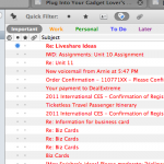
First of all would be the tabbed interface. You can keep everything in a single window which becomes really convenient if you are looking over a lot of messages at once.
Second would be growl notifications. Whenever you get a new email it will show a small notification at the top right of your screen that has the sender and the subject, which is really handy so you know if there is an important message that you need to get back to ASAP.
And third and best of all would be tags.
Basically, you can tag messages and different tags have different colors. You can quickly tag an email by just selecting it and pressing he corresponding number key.
This is great because if I have a chunk of emails I can just hit the arrow key and say Hmm, 1, 2, 3, 4, or 5? Facebook messages are alwas 5, order confirmations 1. Blog comments are always 2. You can add and customize different tags.
This is great because you can search by tags and also add multiple tags to a single email.
So lets say I have a really important message. Lets say that I move it into a folder called Important. When I need to find the email a month later, y first instinct is to look under the inbox. So I would search for what I *think* might be in the email, but I really have no idea. Luckily, instead of doing this I can just tag the email and just do a search for every email with that tag and I’m sure that it will come up.
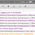
Another fun part of this is that I can have a very colorful inbox 🙂
Name: Firefox
Platform: Crossplatform
Price: free
Homepage: http://www.mozillamessaging.com/en-US/thunderbird/
Screenshots:
-
- Colorful inbox!
-
- TABS!
-
- Search by tag
-
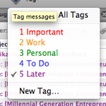
- Tags
Readability
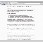
Sometimes we just want to read something plain and simple. But on many sites these days, ads and other things can get in the way of your focus and distract you from your reading. Readability by arc90 fixes this problem by finding the main text and displaying it nice and big, black on white. So you can read your articles distraction free.
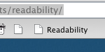
Readability is a “bookmarklet”, which is a bookmark of javascript code. Thanks to this, you can use readability by just clicking a bookmark. This is great because every browser in the world has a bookmarks bar, so every browser in the world is compatable with readability.
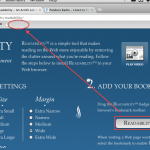
To install readability, click here and choose options on font size, font, etc. Then, just click and drag the big white readability button to your bookmarks bar. Done!


Now, navigate to any article on a website. For this example I am going to use an article from CNN. Once you have loaded the page, click the readability button. ¡Voila!
So here’s the before:

And now, here’s the after!