Google+ is Google’s stab at facebook that has some great new features that really puts it in the competition (read more here). The Android app was available immediately; the iOS app was supposed to come a few weeks after.
Well, it’s here. Unfortunately, it’s not worth getting.
You are greeted with a front page where you can view your stream, profile, huddles, circles, etc. Everything works until you hit stream; that’s where it crashes. It will give you a spinner saying that it’s loading… then it will keep spinning… and spinning… and spinning… and when you’re sick and tired of it, you just hit the grid to go back to the home screen. But it doesn’t go. So you hit it again. Same result. So you start frantically hitting buttons, but it’s not going to respond. Then, there’s the crash.
For now, this is all you’ll get. Jailbroken or not, iOS 5 or 4. The app is just a crasher.
During an earnings call with Apple, the CFO nonchalantly announced that Lion is being released tomorrow.
Lion is the “big cat” name for Mac OS X 10.7, the next operating system for Mac Computers. It was announced a little while ago, and was said to be announced in “July.” Lion brings some new features in Exposé and Spaces, fullscreen apps, and an iOS-like homescreen called Launchpad.
The update will be available in the Mac App Store for $30, and there’s no more discs available.
If you have a Mac, I recommend that you read this post to make sure your mac is ready for Lion.
After using Lion for a little while, I will write a post describing the good and bad of the new features.
Google has introduced a new look to Gmail that has tons of reminiscence from Google+.
Lets compare. Click the below image to open the screenshots in a new window.
If you look at the above screenshots, the first thing you may notice would be the sidebar. In both Gmail’s “Labels” and Google+’s “Circles”, you see that the selected item is highlighted in orange, both in the same font (highlighted in red).
Another similarity would be the buttons. Look at the “Share” button in Google+, then the “Search” and “Compose Mail” buttons in Gmail. You’ll notice that they are the same style and size (highlighted orange).
Last (and frankly least) the logos look the same (highlighted green).
Now lets compare the new Gmail to the old Gmail. Click the below screenshot to open it in a new window.
The buttons are different, and have no similarities to Google+. The selected label is simply bolded, where in the new theme they are colored orange in addition (highlighted red). In the new Gmail, messages are also farther apart (highlighted orange). I guess it gives a cleaner look, and it’s a little less dense on the eyes. In old Gmail, the buttons are less clean than in the new Gmail’s (highlighted green).
I know these are just interface changes, but it shows that Google is trying to really uniform everything around Google+ – even the top bar anywhere on google has been themed dark with orange highlights. Google+ is more than a social network – it is becoming a social Google.
Yes, google is retiring the Blogger and Picasa brands over the next 6 weeks, in a push to Google+.
Picasa is already integrated into Google+, and will probably end up as solely part of Google+ instead of a separate service.
But I don’t know what they plan to do with Blogger. It could possibly be integrated to Google Sites in some way, or it could just be called Google Blogs, or maybe they are going to also integrate it in some way with Google+.
Blogger was a wonderful name: founded a few years ago, then purchased by Google, then substantial growth since then. This very blog started on blogger until I moved to WordPress.
Not to be mean or anything, but I never liked Picasa. It was a clunky, badly integrated service that only made a little bit of sense. When I saw that Picasa was integrated into Google+ as the photo sharing service, I hit my head against the wall a few times. Although I love Google’s photo sharing efforts, I’m not too sad to see Picasa go.
As I said, the retirement will happen over the next 6 weeks. It will be interesting to see exactly how they plan on doing this.
During a live facebook event that took place today, Mark Zuckerberg announced that Facebook has partnered with skype to provide one click video chatting to users.
It is referred to as a “mini skype client” by the CEO of Skype, and installs with a simple download of a java applet.
Zuckerberg claimed that there are no financial agreements with Skype, which is interesting to try and figure out who is benefiting from this. Skype CEO Tony Bates said that “We are planning to add paid skype over time as well.” This means that if you have a skype premium plan, you might be able to group video chat – but that’s just an assumption.
Speaking of group video chat, Facebook doesn’t have it! With Google Hangouts, Google’s chat service that allows up to 10 person video calling, may have an advantage over facebook. However, facebook has 750+ Million users – that’s a lot of people that are one click away from a video chat.
Video chat is available now to the public, just click here to get started.
Since its debut in 1997, Google Search in general has grown in size and strength.
Since then, the keyboard and mouse have always been a primary tool in searches.
In 2008, the Google Mobile App was released to the Android and iOS operating systems, allowing native and mobile searching of the web.
A few months later, they integrated a new feature that they had been working on into the mobile apps called Voice Search. Voice search was a new idea on how to revolutionize searching. But most Google searches were done on the computer, so even if everyone used voice search on their phones, more requests would be made from a keyboard.
Google took a surprising 2½ years to make their next move. Then about a month ago, they released Voice Search online, using the same microphone input as Gmail chat. However, they confined it the Chrome as an experimental search feature.
I think that Google really has enough “innovations” that they’ve given to us and that using a keyboard is just fine for searches. Personally, I talk faster than I type, but I am so used to typing that a switch to talking instead is actually harder, at least for a while. I see where they are going with the user-friendly ideas, but this is one of their kind of unnecessary ones. The recognition accuracy is ok, but as I expected it doesn’t work well with names, even of well-known people.
If you want to try it out, head on over here in Google Chrome and hit Try It Out.
A little while back I changed the theme of Good Morning Geek to a theme called Arras. It had a very newspaper-like feeling, which I really liked.
Then, WordPress 3.2 was released. I upgraded and got a long fatal error.
Crap.
I figure out that it has to do with arras and SSH to my server and delete the theme. I was then able to login and change the theme.
But that means no more arras 🙁
I am using the new Twenty Eleven theme from WordPress, and I like it a lot. I had to redesign the header as in Twenty Eleven the header is much taller than in Twenty Ten – but that was a very minor setback.
There’s always that random thing you want to share with your friends.
Pictures, text, a conversation you had, you’ll always come across something.
Now usually for this we use facebook.
But if you want to share with the public, you usually use twitter.
But twitter is only text. I mean, it’s only 140 characters of it. If you want a picture in it, you have to add in a link that people have to click.
That’s why people have blogs.
But blogs can be a pain to post to. You have to login, create a new post, add in the stuff, then post it. It’s really not worth the time.
And blogs tend to look kinda standard. I mean, they can look nice, but they all look the same.
I have a solution for this.
Part 1: The blog
tumblr.
Tumblr is a customizable and free blogging platform that is easy to use.
Unlike others, you can post text, but it gives you separate things for text, links, conversations, audio, quotes, and video. And they all show up in their nice ways (quotes have “s around them to make them look quoty). It’s flexible and postable by mobile, and you can have it post to your twitter, facebook, etc.
I did a review of cortex a little while back and let me just say that it is still beautiful.
Cortex is a chrome extension for sharing things really fast. Here’s a demo video that I made (and that was used in the review of cortex on mashable, let me have you know):
As you can see, there is that magical t for you to post to tumblr, so you could use that to publish things quickly to your blog.
One cool thing about it is that you can use it to yes, share just the link to the webpage, but if you click and hold over an image it will share the image (and it will post it to tumblr like an image too). Select text and click and hold over that it will share the quote from the webpage (and yes, it will post it to tumblr like a quote). Click and hold over a youtube video and it will share the video, not a link (and YES, it will ALSO post it to tumblr like a video). It’s nice to see the cortex is so well integrated.
As I said, cortex is a chrome extension, so if you are desperate for sharing you may have to switch to chrome (which really isn’t such a bad thing let me have you kn0w).
While it’s nice to have a blog in reverse chronological order with one thing on top of the other, you can spice it up a little but with an amazing theme called organ.
What it does it makes everything in to skinny rounded columns (reverse chronological order from right to left) and does different things depending on what they are.
Every different type of post has differently colored columns.
Pictures it will take a strip of the picture and show it in the column.
Everything text (text quotes links) it will adapt the text to go with the theme and then mumble jumble it in big letters down/across the column.
Now you may say “what the hell, I can’t see any of the text!”. Well, there’s an answer. Hover over a column and it will expand to show you a little bit more.
Hovering over the text will make the beginning of it drop down sideways in a single line. Then, you can click on the arrow that shows up at the top of the column and see the full posting.
It’s nice because at first it shows you a lot of posts in a very small space, then when one looks interesting you can hover over it, and if it’s a dud you can hover over another (without having the page have to reload) and if it’s a good one then you can click on the arrow to expand it (and wait for the page to load but it’s probably worth it).
To get this theme on your tumblr, choose to customize your site, click on theme on the top bar, and scroll WAY DOWN to the free themes and find the one called organ. It will be near fluid. 🙂
Personally I use this system to share EVERYTHING, so my site ends up looking like brain vomit. Because it’s so easy, I post to it ALL THE TIME. It’s nice because it’s constantly updated and there’s no thought put in to it. Oh, I think this looks cool. SHARED.
BOINC stands for Berkely Open Infrastructure for Network Computing. And I want to appreciate what they are doing with their Distributed Computing platform.
Basically, you download an app to your computer. And when your computer is not in use, all of it’s power (or as much as possible) goes over the internet to berkely so essentially they have a supercomputer of all of these other computers (hence distributed) to go to cure diseases, detect pulsars, and other scientific stuff. It’s an easy way to donate something that could be extremely useful to the cure. The help of the world. So many other scientific things that will get us farther along and allow us to make discoveries of all sorts.
I think that other than being really cool, the BOINC distributed computing platform is an amazing idea. So many people are away from their computers and they leave the potential of power just sitting there. It’s like donating your computer to UC Berkeley for scientific research, but only for the time when you aren’t there.
This is great if you have a LOT of extra computers around you can join this and put those lazy things to work. I read the idea and I just thought to myself. Genius.
Now what’s really cool is that you can actually select which cause you want your power to go to. There are so many categories (all of which support various operating systems) for you to benefit to.
Unfortunately to get it all working it’s pretty simple but can get kinda complicated.
Then click here to go see which things you can benefit to. Then find one that has a cause you would like to benefit too. Then, in boinc, click add project. On the page where you found the cause, look at the name in the left-most column. Find that name in the window of boinc and select it. It will connect to the project then ask you to setup an account and stuff like that. Once you are done with that, boinc will start to download work from the server. One thing you may want to do is open the preferences and select some limits on how much power of your computer it is allowed to use. I made it so that it would only do work after the computer was idle for 1 minute, because I want all of the power of my computer when I’m using it but when I’m not I don’t find a point in letting it sit there useless. I also only allowed it to use 2GB of space on my disk, as I don’t want too much disk space being sucked up by this cause. I also told it to use only 70% of my computer’s processor as I don’t want my computer to overheat either.
I think that this is a great and free way for people to contribute to causes without having to use money. Enjoy 🙂
I’m sorry. I really am. This is, indeed, yet another web browser.
I was recently at a technology summer camp (I’m taking a class about photoshop) and the same instructor that ended up switching me over to macs kept telling me about how mazing omniweb was. I wasn’t convinced until I finally decided to download it.
The first thing you notice is speed. I know that people call chrome fast, and, well, it is. But from tests on Good Morning Geek, it seems as though graphics render either faster or from top to bottom. I’m pretty sure omniweb prioritizes the top of the page for rendering, as the header seems to appear almost instantly, followed by widgets in the sidebar. In chrome, it takes a couple of seconds for the header to appear.
Other than that the big thing is tabbed browsing. So lets say I have a lot of tabs open in Safari. I mean a LOT. In the menubar it shows the tabs as txt, the name of the webpage. But when it gets crowded things get a little harder to make out.
(click to expand) As you can tell, it’s kind of hard to tell which news article that CNN page is about. What if I have ten CNN tabs open but all I see at the top is CNN:…
OmniWeb takes a new approach. Thumbnails.
I don’t even need to figure out what the text is trying to refer to, I can just take a glance at the tabs and click the one I want to look at. And even if I have 20 tabs open, the thumbnails don’t get smaller because you can scroll through all of your thumbnails.
Another cool thing is the ability to load tabs in the background. I know this isn’t new to the field of browsers but I find that the system it uses to tell you that a tab in the background is loading (and when it is finished loading) very unique.
When a tab is loading it is greyed out and has a spinny thing in the top right.
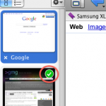
When a tab in the background has finished loading, OmniWeb does a nice job of letting you know.
If you open the tab the check mark wil go away.
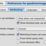
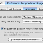
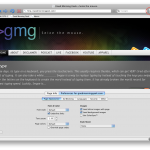
Other than that there is one more key feature to this: site-specific browsing options.
On any website you can click a button in the top right and select your options for ads, appearance, security– let’s just show a screenshot.
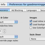
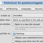
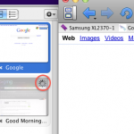
The button to toggle the pane is shown in the top right.
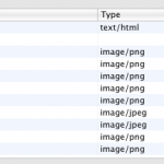
As you can see there is also a page info pane where it shows you all of the images, scripts, stylesheets, and frames on a webpage. Here’s a gallery with pictures of each and every pane, plus all of the other screenshots from this post:
The button to toggle the pane is shown in the top right.