How Hex Codes Work

I know, a lot of you out there won’t be needing this anytime soon, but I think that the way digital web colors work is cool, and I think that you will too!

When designing websites, color is always important. What color should the background be? The font?

All of these colors are chosen within CSS. CSS has a few basic colors built in, like white and black but everyone would like more specific colors. My screen doesn’t have millions of colors for ‘nuthin!

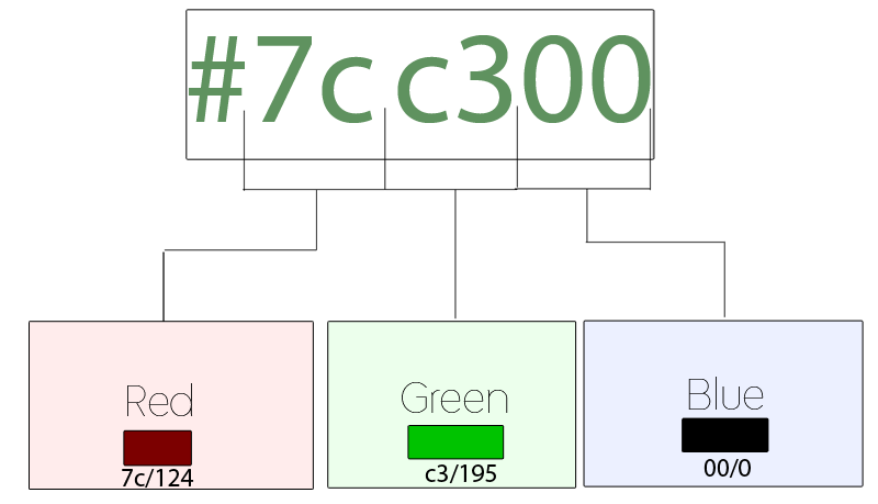
In CSS, specific colors are entered via hex codes. These go #123456, where each digit ranges from 1-F (0123456789ABCDEF). Because colors are composed of three values, Red, Green, and Blue, two digits of a hex code are for each.

This is a bit difficult to explain, so I made a diagram just for you:


For example, if your hex code is #FFFFFF, thats FF for red, FF for green, and FF for blue. FF is the highest possible value, so as much of all colors as possible results in white. It’s the same with #000000: no color at all means black.

If you were to have #FF0000, that’s the highest value for red and no value for anything else; you’ll end up with pure red.

I hope you enjoy having yet another little nugget of tech information in your mind! Use it wisely! 🙂

Why Google+ Is Failing

When I was at the Teens In Tech conference, a speaker told me this:

For your product to succeed, it either must be a new idea or be better than a previous one.

It makes sense – why would anyone switch to your product if there’s already one that does the same thing? Your product needs to have more to offer so people would actually have a reason to “convert.”

Unfortunately, there are few tech companies that succeed with new ideas – so a lot take old ideas and refresh them to make ’em better. For example, every Apple product ever created; The iPhone wasn’t the first phone in the world – it was just better than the rest; The iPod wasn’t the first small music player ever created – it was just better because it could hold so many more songs and didn’t need CDs or Cassettes.

Okay, so lets take a look at Google+. It’s a great social network that has tons of new features that are definitely in demand. Who would wan’t multi-person video chat, along with a slew of easier to manage privacy features?

“Okay, so Google+ “better” than facebook – but why isn’t it succeeding?”. This is a question I’ve been asked many times.

Lets think about it in terms of a lamp (yes, the one on your desk). First, we have our facebook: A standard lamp with a normal switch that emits very bright light. Then, lets look at our Google+: A large, fancy lamp with pretty designs on it, a bendable neck, and voice activated controls – but we forgot to add in a socket for a lightbulb.

In this analogy, our Google+ Lamp is “better” than our facebook lamp – but it doesn’t do what people want to use it for (illumination).

Lets take that analogy back to Facebook and Google+. What is the real reason people ever go on facebook?

The real reason is their user base. There are very very few people who aren’t on facebook, and there are very very few people on Google+. Google+ has all the new doohickeys and thingamajigs, but it’s forgetting the light bulb (user base).

And because nobody is on Google+, nobody wants to join – they’re satisfied with Facebook and their 1500+ “friends.” What’s the use of having a ten person video chat if there’s not even ten people on Google+?

Google+ is a good idea, with a perfect execution – but the social networking field has been completely dominated by Facebook and Twitter. It’s unfortunately like this for many social internet startups: many of them rely on a user-base to be the least bit useful, and without a user base you won’t be able to expand your user base. You can get a user base by having a user base, because if you have a small user base people want to join to be part of that user base, which makes more people want to join etc.

Hence the reason most social startups fail. Gaining a user-base is a domino effect, with the first domino being a giant brick wall. You need to hope that something will come and knock it over, as getting the domino train started is definitely the hardest aspect of the whole process.

The Impact of Customer Service

Customer service makes a big impact on how people look at your company. Here’s two examples of personal experiences with customer service – one bad, one great.

The Bad

Recently, my sister’s MacBook had a little breakdown. The trackpad stopped working.

I knew how to fix it, I just take it apart and switch out the trackpad. So now, I just needed to get the trackpad.

I found a site on like called Mac Parts Online. I clicked on my sister’s model of MacBook, then clicked on the trackpad. It redirected me to a shopping page, where I then ordered the trackpad.

Upon arrival, I found that it wasn’t the correct model of trackpad. This trackpad was for an aluminum MacBook!

I went back to the site and looked for an email address or phone number. I found a contact page and over the course of a week sent them messages three times. I never got any response.

Eventually, they started responding. After some arguing, they regretfully accepted it for a return. On top of that, I had to pay a 25% restocking fee.

So first, your site misinforms me about what product to get, then you don’t reply to my messages, then you finally accept it for return, and charge me 25%?!

I know I won’t be shopping here again. Ever.

  • Website was misleading
  • Slow response
  • Unfriendly Customer Service
The Great

I was recently looking around for some photography gear. I found a site called Photojojo, full of a ton of different nicknacks and photo related toys and supplies.

I found a lens called the Diana+ that I was really interested in. Upon reading the description, I could tell this was going to be fun.

Simply attach the plastic lens and its adapter directly onto your SLR’s body (Nikon or Canon) and shoot away. With one part Diana camera (old school lo-fi plastic) and one part modern DSLR you’ve got yourself one mighty fine recipe for unconventionally amazing photographs.Finally! A way to re-invent your style while kicking it digital with the hip kids and their plastic cams. (And for future reference, Thomas Kinkade = not hip).

Instead of a machine writing this, there’s a real person writing and not just filling out a form description made by some manufacturer in china.

As you may have read, it works on Canon and Nikon SLRs. But what about my NEX-5? I have a nice NEX-5, but it doesn’t take Canon or Nikon Lenses.

So, I thought, I could just get a Nikon to Sony adaptor and I’ll be set! I’ll put the Diana+ Lens in the nikon adaptor, then the Nikon adaptor onto my NEX adaptor.

But there was one potential problem with this – would there be a problem because the lens would be two adaptors away from the CCD in my camera?

To answer this, I turned to Photojojo. I found their contact page quite easily, sent them a message, and within a day they responded.

Hey there Max!

I can’t say for sure since I don’t have your camera or that snazzy Sony to Nikon adapter to test it out, but best I can tell I think that setup would work great!

I don’t think the extra distance will make much of a difference and that combo of adapters is your best chance of using Diana lenses on your camera so I’d say give it a shot!

If I’m totally wrong and it doesn’t work for ya we’ll take the Diana Lens and Nikon adapter back easy peasy!  (Just be careful to keep all the packaging together and don’t rip the boxes when you open them if you can help it).

Hope this helps!  If you have any questions, I’m just a keyboard away.  And once you get it all set up please let me know how it works for ya (and feel free to send me some pictures too! – I love seeing what folks come up with!)

 —

Julieanne

Silly Putty Enthusiast and

Photojojo Customer Support

Upon reading this email, I just wanted to hug the person who responded. They talked to me like I was their best friend in the world. They were nice, personal, helpful, and still professional. They also said that I can refund it, and the way they used very personal language like “snazzy” and “easy peasy” just made me know that I was an appreciated customer. This is customer service.

I then proceeded to order the lens, and I then got a shipping notification. It said that I could watch my order come on this “Shiny new page.” I clicked on the link, and here’s the page I got:
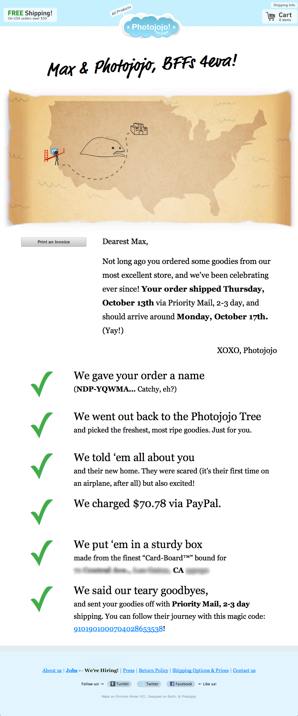
 

Look at that. It even gives me a little picture showing the package on it’s way to California. They used really cute language, like saying the went out to the “photojojo tree”. Every little word of this is spiced up and makes me feel warm and fuzzy inside.

  • Easy to use site
  • Personal yet still professional language
  • Quick, helpful, nice, personal response
  • Easy return policy
Who wouldn’t want to shop here?!
Why
We all buy things online. But whenever you buy something that you can’t use/try out immediately, there’s always a risk – it might not work, it could be broken, it could be the wrong model.

If we can trust the site, then we are far more comfortable with taking that risk, as if it were to ever happen that there was a problem we know that the site will be helpful. Machines can’t really manage returns, and when the person on the other end is mean and nasty you don’t even want to bother trying to talk to them.

That’s why with Photojojo, I want to order from them a ton of times just so I can get their snazzy emails that make me feel so nice and fuzzy and warm and happy and unicornaliscious. (See what I did there? Seems like something Photojojo might say.)

If you own a company, Customer Service should be your first priority, followed by quality of the product. After all, what’s the good of a great quality product – with the wrong part number that can’t be returned due to your awful customer service? You’ll end up like Mac Parts Online – with dissatisfied customers who will definitely not return.

Do your best to be a Photojojo – Be professional, personal, and make people want to talk to you, not just need to talk to you.

Goodbye, MacBook

No, I’m not talking about the white one (post here).

I bought an aluminum MacBook in 2008, and it has lasted me until today. I loved it, it was reliable, and has lasted through three software versions. I have used it for three years straight, rarely skipping more than 8 hours without using it.

And today, it has finally left us.

I’m not getting rid of this computer, as it was my first real computer and has signatures of apple engineers on the bottom.

You’ll get to find out what computer I get next when I write a post about it. 🙂

Oddly, however, today is the same day that Steve Jobs has resigned from his CEO position at Apple. Coincidence? I think not.

maxeh.me

Here on Good Morning Geek, I post fairly professional reviews, opinion, news, etc. However, sometimes there’s things that readers might like to know about, but just don’t have the same professionalism to fit in here on Good Morning Geek.

That is why I have made a new, smaller and less professional site – maxeh.me.  I post about more random stuff, with possibly a few more typos and/or grammatical errors.

Enjoy!

Goodbye, White MacBook!

Apple recently announced a refresh to the MacBook Air line which includes a much faster processor, bringing it up to par with other more-powerful machines. I didn’t think of it as much – MacBook Air is less slow and more go. This means that instead of being a shiny piece of cutlery, it can now actually be used for real life applications.

But what Apple didn’t make obvious is that they have completely eliminated the white MacBook from the line of their computers. Completely.

It’s gone.

Not a trace of polycarbonate shells anywhere.

This means that the MacBook Air is now the entry-level MacBook, and it features a faster processor and better graphics card while only taking up half of the space – for the same price. Sounds pretty good, right?

However there’s a downside: for the entry-level Macbook Air, you only get half as much storage as you would for the now eliminated entry-level white MacBook. The entry-level white MacBook came with a 160GB internal HDD standard, but the identically-priced entry-level MacBook Air comes with a mere 64GB of Solid State Storage. Solid State does have a benefit over normal HDDs in that they boast much faster read and write speeds, however media junkies will have to pay a bit more to get the space that their data craves in the MacBook Air.

I’m afraid this marks the end of the MacBook in general. Now there are only two notebook lines from Apple, both of which have a three letter word stuck to the end (Pro and Air). This also means that we are unibody-only; you will now be seeing VERY little plastic in the Apple stores in general (including the fake ones in china).

The MacBook had a great run and attracted TONS of sales – but with everyone investing their money in more updated and capable aluminum MacBooks, the original MacBook simply had to go.

Mac OS X Lion

Two days ago, I wrote a post saying that Lion was coming the next day.

Right again.

We’ve been waiting to hear the mighty roar for quite a while, and it’s finally audible to all who desire to hear its beautiful outpour (too far?).

Mission Control

Mission Control

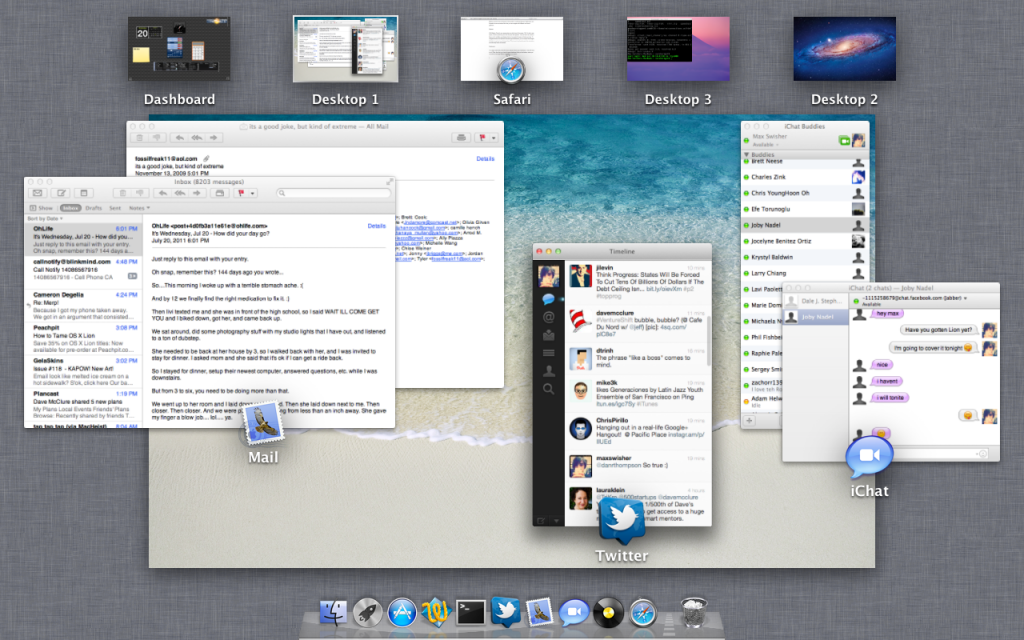
Mission control is the real big part of this update. It combines Spaces, Dashboard, and Exposé into one convenient view that you can navigate with different multi-touch gestures.

To access Mission Control, just swipe up with three fingers.

Spaces:

With Mission Control, your spaces show up at the top of the screen. (Tip: To add a new space, hold the option key and click the plus that appears – this one took me a while to figure out.) In addition, applications that you’ve made full screen will show up here. To navigate between the Spaces/Fullscreen apps/Dashboard, you can swipe three fingers left/right at any time to go between them. This is one of my favorite parts; the animations are extremely fluent and smooth.

Dashboard:

You might notice that on the left of your spaces, there’s your dashboard – that’s all there is to it! Other than that, you have the same dashboard that you had before, where you can add and arrange different widgets for your needs.

Exposé:

As you can tell by the picture above, all of your running applications in your current space will group and display with an icon and a label. It’s just like the previous exposé, with a couple of little visual upgrades.


As I mentioned, there is now support for full-screen apps. I could make a completely separate section for this, but what is there to say? You can click a little icon in the top right and the app will take up the whole screen. Whoopdidoo!

Launchpad

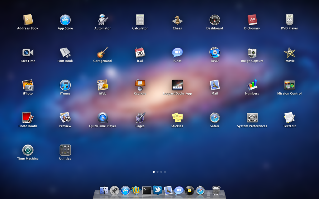
Launchpad is basically the iOS home screen for mac. You’ll get a little rocket icon in your dock, and clicking it brings up Launchpad which looks a bit like this:

Launchpad


You can swipe between the screens with two fingers. If you’ve ever used an iOS device, you know how this works: click and hold to rearrange the icons, or even move them into folders. You can even remove an app by clicking the X. Looks like iOS to me.

Versions, auto-save

I’m not going to cover this in too much detail.

Versions will keep track of all of your changes in your documents, and if you want to revert to an older version or get older elements, you can scroll through different “versions” of your document. Unfortunately, this isn’t available in many applications yet – mostly just the iWork suite – but should become more available as apps are updated to be compatible with Lion.

Auto-save is fairly self-explanatory: Your documents will be automatically saved.

Conclusion

There’s TONS of other features in Lion, and I’ll be posting different tips/tricks as I find them. There’s TONS of other new things in Lion, like a new prettier Mail app and more effects in Photo Booth – however these are small improvements. You can read more about all 250+ little new features over here.

Where can I get it?!

Unlike previous versions of OS X, this update won’t come on a disc. Instead, just go to the Mac App Store and Lion will be in there for $30. You can download and install instantly (time may vary, depending on your internet speed of course). Click here to open Lion in the Mac App Store.

Enjoy the roar of the lion.

RAWR!


Google+ for iOS released, Welcome to Crash Central

Google+ is Google’s stab at facebook that has some great new features that really puts it in the competition (read more here). The Android app was available immediately; the iOS app was supposed to come a few weeks after.

Well, it’s here. Unfortunately, it’s not worth getting.

You are greeted with a front page where you can view your stream, profile, huddles, circles, etc. Everything works until you hit stream; that’s where it crashes. It will give you a spinner saying that it’s loading… then it will keep spinning… and spinning… and spinning… and when you’re sick and tired of it, you just hit the grid to go back to the home screen. But it doesn’t go. So you hit it again. Same result. So you start frantically hitting buttons, but it’s not going to respond. Then, there’s the crash.

For now, this is all you’ll get. Jailbroken or not, iOS 5 or 4. The app is just a crasher.

Mac OS X Lion: Coming Tomorrow!

During an earnings call with Apple, the CFO nonchalantly announced that Lion is being released tomorrow.

Lion is the “big cat” name for Mac OS X 10.7, the next operating system for Mac Computers. It was announced a little while ago, and was said to be announced in “July.” Lion brings some new features in Exposé and Spaces, fullscreen apps, and an iOS-like homescreen called Launchpad.

The update will be available in the Mac App Store for $30, and there’s no more discs available.

If you have a Mac, I recommend that you read this post to make sure your mac is ready for Lion.

After using Lion for a little while, I will write a post describing the good and bad of the new features.

Mac OS X Lion is Right Around the Corner!

Mac OS X Lion was announced a while ago and brings new features like Launchpad, an iOS like App Launcher; Mission Control, which combines Spaces and Exposé into one, easy to view panel; and plenty of other new features.

The announcement stated that the update would be released in July 2011, and would be downloaded directly from the Mac App Store for $30.

Well would you like at the time, it’s July!

The Mac OS X Lion update is estimated to be released to the public in the next couple of weeks, according to my reliable sources.

There’s a few things you should probably do to make sure your computer is ready

  1.  Make sure you have some disk space available!

If you don’t, you’ll download the Lion update and your computer won’t be able to easily boot. Make sure you have at least 6 gigs of disk space free. If you don’t, you’re in trouble whether you’re installing Lion or not! Try an app called GrandPerspective (reviewed here) and delete the biggest files.

2. Say goodbye to PowerPC

Over the years, Intel machines have been compatible with PowerPC Apps through a bridge called Rosetta. Now, with Lion, Rosetta is no longer compatible. If you have any apps that run on Rosetta, it’s time to find Intel compatible alternatives.

3. Install all available updates

Go to the Apple Menu > Software Update… and install any available updates. After you’ve installed the updates, re-check for updates in case there are updates for the other updates.

As I said, OS X Lion should be available from the Mac App Store in the next couple of weeks for only $30.

How-to: Change fonts in iOS

Almost everyone is very used to the default iPhone font – Helvetica. It’s plain, simple, and easy to read.

People are usually just fine with Helvetica – but if you’re jailbroken, it might be a nice unique touch to change your font. And because text shows up EVERYWHERE in iOS, you’ll always get to enjoy your font change.

To change the font(s) on your iPhone, you’ll need an app called BytaFont from Cydia. Just open up Cydia, go to search, and type BytaFont and install it – no additional repos needed ;). If you have a Verizon iPhone 4, click here to read my post about 2 step jailbreaking.

After you’ve downloaded BytaFont, you can tap “Browse Fonts” to get a few options for browsing: Staff picks, most recent, most downloaded, most appreciated, alphabetical, and by category. Unfortunately it’s as hard to navigate as it sounds. The fonts under most appreciated are nearly impossible to read, and looking through a huge list of fonts (where all you see is the title of the font in Helvetica) doesn’t help me determine which font I’m looking for.

There are tons of fonts that are available for you to use (all for free, of course) from BytaFont. Some of them are basic, like Tin Birdhouse. Some of them are complex, like Halo 3 (which I simply just can’t read).

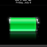
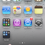
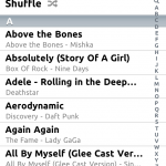
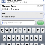
I decided that I liked the Ubuntu font. It’s clear and still easy to read, but it’s still different from boring helvetica. Here’s how it looks in a few situations on iOS.

Google introduces new look to Gmail, inspired by Google+

Google has introduced a new look to Gmail that has tons of reminiscence from Google+.

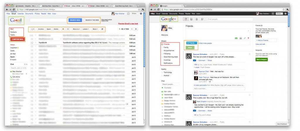
Lets compare. Click the below image to open the screenshots in a new window.

If you look at the above screenshots, the first thing you may notice would be the sidebar. In both Gmail’s “Labels” and Google+’s “Circles”, you see that the selected item is highlighted in orange, both in the same font (highlighted in red).

Another similarity would be the buttons. Look at the “Share” button in Google+, then the “Search” and “Compose Mail” buttons in Gmail. You’ll notice that they are the same style and size (highlighted orange).

Last (and frankly least) the logos look the same (highlighted green).

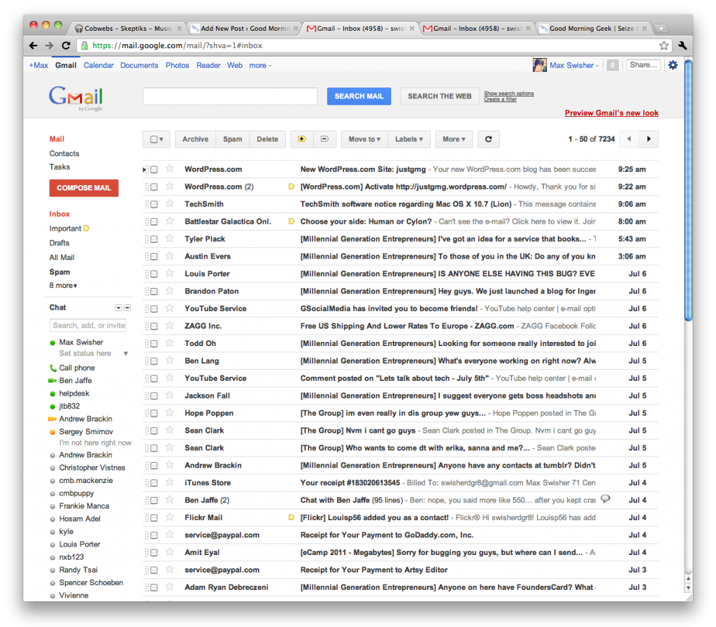
Now lets compare the new Gmail to the old Gmail. Click the below screenshot to open it in a new window.

The buttons are different, and have no similarities to Google+. The selected label is simply bolded, where in the new theme they are colored orange in addition (highlighted red). In the new Gmail, messages are also farther apart (highlighted orange). I guess it gives a cleaner look, and it’s a little less dense on the eyes. In old Gmail, the buttons are less clean than in the new Gmail’s (highlighted green).

I know these are just interface changes, but it shows that Google is trying to really uniform everything around Google+ – even the top bar anywhere on google has been themed dark with orange highlights. Google+ is more than a social network – it is becoming a social Google.