Ah, photography. The practice of capturing moments in a still representation of the world, then bringing them back to life with just a glance.
Photographs are awesome. We take cameras and photos for granted, as we can capture a moment of our lives at anytime and anywhere thanks to phone cameras. Really, photos are something that our lives wouldn’t be complete without. What if you never had that picture of your boss wearing a party had upside down (didn’t think that was possible, did ya!)? Or of your cat standing up?! Or of that lizard licking your friend’s nose?!
There are some things that we just can’t keep in our mind in full detail. We can’t remember moments exactly as they happened (unless, of course, you have photographic memory), so we have photos to help us. They’re captures of our world that can be stored and recalled to bring back memories that we may always treasure.
Once we take these magical photographs, we can do one of a few things with them.
One option is to leave them on our phone to be scrolled back to when showing something to someone.
Or you could upload them to facebook to share that magical moment with all 1,500 of your closest friends.
I like to do something else with my photos – something that is unfortunately hard to find these days, but it’s still a practice that we will never be able to replace:
PRINTING.
Yes, like with paper. And ink. (gasp)
Printing is this amazing practice where you get a physical copy of your photo which will exist without electricity and without the internet. It’s a magical thing that people really aren’t wont to doing anymore.
And there’s another benefit to printing your photos: You get to display them wherever you desire. With a printed photo (and maybe a little bit of tape), you can put that memory wherever you please and you’ll always be reminded.
This is often done with a picture frame. Honestly, I have nothing against the picture frame. You get your photo with a border of sorts behind a piece of glass standing up wherever you want it, or nailed to a wall. It’s a great idea, the picture frame, that will always be prominent (at least around people who actually print some of their photos). But I think that we could be a little more creative. We are the world’s artists, the world’s craftsmen – so we should build something for our photos that really makes the world – and our walls – a better place.
Ladies and gentlemen, I introduce fotoclips.

Yup. That’s it. That tiny little plastic clip.
 But with simplicity comes possibility. With this clip, two photos can be joined together.
With two clips, you could conjoin three photos.
Imagine what you could do with 100 of them, hmm?
Fotoclips are the super simple way to make awesome things out o
f your photos. These turn your photos into building blocks, and the rest is up to your imagination.

One pack of Fotoclips comes with 100 of those 2D clips, and 10 orange clips. These magical clips transport your photos into a new dimension – THE THIRD ONE!
These orange clips let you make corners – meaning that your photos can turn into amazing things like boxes and rectangles!
Fotoclips take your memories and make them even more creative than they were in the first place.

Imagine the possibilities!
In the past, fotoclips have been used to make wall murals, hats, lamp shades, and even dresses. A photo dress – now that’s what I call creativity!
Fotoclips are also awesome because they involve no glue and don’t damage your beautiful snapshots at all. If you ever get bored of your creation, just take it all apart and build something new. It’s that simple.
One of the most popular things to do with fotoclips is to make wall murals.

That’s a mural that I made out of the first prints off of my Lomo LC-A+. Each fotoclip has a little hole drilled out in the middle where you can stick a nail, or a thumbtack, or anything else you desire – but due to the condition of the wall, I just put some painter’s tape on the back of each photo to hold it up.
Want to make your own photographical compositions? It’ll only cost you about ten buckaroos over at the Lomography shop. The possibilities are only your lunch money away!
Fotoclips at the Lomography Online Shop

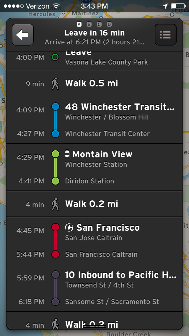
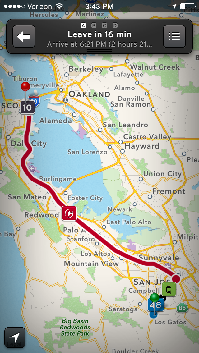
 As a 15-year-old, I don’t have a driver’s permit or any vehicle to drive. But that doesn’t mean that I don’t still have places to go.

 Computer screens will get dirty. That’s just how it is. Hyper-salivating friends, sloppy dogs, and fingers all contribute to the inevitable film that will build up on your beloved machine.
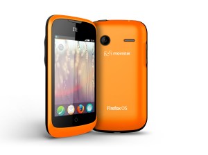 At Mobile World Congress, a bunch of people with ties huddled into a room in Barcelona, Spain to hear what Firefox had to say.