There’s more to a good product than a good idea


When you think of creating a product, the first thing that comes to mind is always the idea. The idea is really the heart of a product. It is what makes people use it, what makes people discover it, and what makes it worth creating. A bad idea in the first place will always cause complete failure.

I would insert an example of a company where this happened, but frankly, if a company has such a bad idea that it fails, then it’s such a bad idea that nobody ever will take note of it. The idea is what determines everything…. almost.

Once you have your good idea and a company built, you aren’t done. It needs to be available to people, at least 99% of the time. I am going to relate this to the battery life vs. features scenario. If you get a phone that packs the most features and amazing performance with unbelievable power, but it arrives with no battery, then it’s all a failed effort. Something as simple and cheap as a battery can determine the value of the rest of the whole device. This same thing applies with any product or website. If it isn’t available to people or keeps failing/crashing, then the rest of the whole product becomes useless.  You need something to power and maintain your idea, because unfortunately, ideas aren’t self-sustaining.

I am going to bring this whole thing down to a specific example, which was the reason I am writing this post.

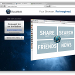
The example is chi.mp. The idea behind chi.mp is to aggregate everything from you into a single page. Blog posts, flickr posts, twitter updates, facebook updates, and a whole slew of other things is aggregated into a single page. Your page can be yournamehere.mp, so you can avoid subdomains, but still for free. Pretty good idea in my opinion.

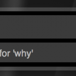
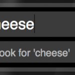
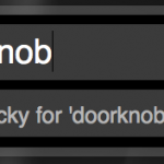
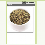
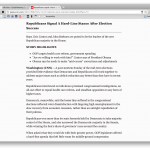
However, the battery tends to become disconnected (metaphorically speaking). Every other page you get this error:

And after a plethora of refreshing, it still displays this. I clear my cookies and cache and a few refreshes later it loads something.

Because of this lack of service (and confusing error messages), I am abandoning this service, as many other people would do. Every browser on every OS, the same thing happens. So this is NOT a problem with your computer, but a problem with THEIR back end (a.k.a. battery).

This example is proof of the title of this post: No use having great features and a great idea if you just plain can’t get to them.

So when you have your magnificent idea, make sure it has a stable power supply.

Opera 11

Opera features a clean, blended interface

Opera has always been a web browser that kind of lagged behind everyone else. Although it had some interesting features, the speed, interface, and stability put it pretty low on the list (next to internet explorer).

But with Opera 11, this web browser brings some nifty new stuff to the table.

The biggest thing that is new in opera would be tab stacking. With tab stacking, you can

A tab stack with twitter and facebook

drag one tab over another and it will create a “stack.” Then, when you hover over it with your mouse, the page previews of all of the tabs in that stack show up.

I see why this could be useful, as this officially eliminates the need for multiple browser windows. I can have a tab stack for my google docs, a tab stack for my website editing, and a tab stack for all of my email.

In benchmarking tests, Opera rated second slowest next to firefox. So you can’t go for this browser for speed. Also, Opera boasts its “Opera Turbo” addition, which supposedly compresses the webpage on opera’s servers then send the compressed version to the computer. However, with this turned on, nothing ever loads at all. With opera 9, I couldn’t get the browser to load anything even with it turned off. So at least in Opera 11 with Turbo turned off, things load… usually. Sometimes things just plain don’t show up. After a plethora of refreshing, stopping, and re-entering the URL, you can usually get things to load. Note: This only happens once in a while, but can still be annoying.

There are a couple other nifty features I would also like to note. When you save a

Expanded thumbnail view of your tabs

password in the password manager, whenever you go onto that same site just press command-enter and it will fill the login and hit return, all so you don’t have to. This makes the whole logging in thing a bit less tedious. Accidentally hit that X on your tab? No problem, just hit the little closed tab button in the top right and your recently closed tabs will be shown so you can get back to it. And one last tiny little nifty feature: you can expand the tab bar so in addition to showing the page title it also shows a thumbnail view of the page.

Opera 11 is available both for Mac and PC, each fitting in with it’s appropriate interface. Links below.

Opera 11 for Desktops

Twitter for Mac

Tweetie for Mac has always been the preferred twitter client on Macs. However, when the makers of tweetie, atebits, were bought by twitter, we didn’t know what would happen. The tweetie for iPhone was updated and called Twitter for iPhone. We were waiting for Tweetie version 3, but that came to us as an app in the Mac App store called Twitter for Mac.

If you use Tweetie you’ll immediately recognize the interface. The interface of this app is extremely simple and effective. You have a small bar on the left with your timeline, mentions, direct messages, and searches. However with this update we also have lists, which allows you to view your lists that you’ve made, and profile which allows you to view information about your profile.

A couple of small tweaks have also been made, as the window is round and the bar is a bit darker and the dock icon has been modified to have the official twitter bird in it.

But one of the biggest upgrades in this would be speed.

It’s just so fast! You click something and it goes and it loads. Bam.

Also, with DMs, messages come in with a matter of seconds. That makes it extremely useful to use similar to IM, which can be handy (although I don’t use that too often).

You can get Twitter in the Mac App Store for free, and for your convenience here’s a direct link. 😉

Cortex+tumblr+organ=beauty

There’s always that random thing you want to share with your friends.

Pictures, text, a conversation you had, you’ll always come across something.

Now usually for this we use facebook.

But if you want to share with the public, you usually use twitter.

But twitter is only text. I mean, it’s only 140 characters of it. If you want a picture in it, you have to add in a link that people have to click.

That’s why people have blogs.

But blogs can be a pain to post to. You have to login, create a new post, add in the stuff, then post it. It’s really not worth the time.

And blogs tend to look kinda standard. I mean, they can look nice, but they all look the same.

I have a solution for this.


Part 1: The blog

tumblr.

Tumblr is a customizable and free blogging platform that is easy to use.

Unlike others, you can post text, but it gives you separate things for text, links, conversations, audio, quotes, and video. And they all show up in their nice ways (quotes have “s around them to make them look quoty). It’s flexible and postable by mobile, and you can have it post to your twitter, facebook, etc.

tumblr.com

2. Time

Cortex.

I did a review of cortex a little while back and let me just say that it is still beautiful.

Cortex is a chrome extension for sharing things really fast. Here’s a demo video that I made (and that was used in the review of cortex on mashable, let me have you know):

As you can see, there is that magical t for you to post to tumblr, so you could use that to publish things quickly to your blog.

One cool thing about it is that you can use it to yes, share just the link to the webpage, but if you click and hold over an image it will share the image (and it will post it to tumblr like an image too). Select text and click and hold over that it will share the quote from the webpage (and yes, it will post it to tumblr like a quote). Click and hold over a youtube video and it will share the video, not a link (and YES, it will ALSO post it to tumblr like a video). It’s nice to see the cortex is so well integrated.

As I said, cortex is a chrome extension, so if you are desperate for sharing you may have to switch to chrome (which really isn’t such a bad thing let me have you kn0w).

Cortex homepage

Cortex on Chrome Extensions

3. Blog appearance

While it’s nice to have a blog in reverse chronological order with one thing on top of the other, you can spice it up a little but with an amazing theme called organ.

What it does it makes everything in to skinny rounded columns (reverse chronological order from right to left) and does different things depending on what they are.

Every different type of post has differently colored columns.

Pictures it will take a strip of the picture and show it in the column.

Everything text (text quotes links) it will adapt the text to go with the theme and then mumble jumble it in big letters down/across the column.

Now you may say “what the hell, I can’t see any of the text!”. Well, there’s an answer. Hover over a column and it will expand to show you a little bit more.

Hovering over the text will make the beginning of it drop down sideways in a single line. Then, you can click on the arrow that shows up at the top of the column and see the full posting.

It’s nice because at first it shows you a lot of posts in a very small space, then when one looks interesting you can hover over it, and if it’s a dud you can hover over another (without having the page have to reload) and if it’s a good one then you can click on the arrow to expand it (and wait for the page to load but it’s probably worth it).

To get this theme on your tumblr, choose to customize your site, click on theme on the top bar, and scroll WAY DOWN to the free themes and find the one called organ. It will be near fluid. 🙂


Personally I use this system to share EVERYTHING, so my site ends up looking like brain vomit. Because it’s so easy, I post to it ALL THE TIME. It’s nice because it’s constantly updated and there’s no thought put in to it. Oh, I think this looks cool. SHARED.

To check out my site done this way head on over to tumblr.maxswisher.com!

BOINC

BOINC stands for Berkely Open Infrastructure for Network Computing. And I want to appreciate what they are doing with their Distributed Computing platform.

Basically, you download an app to your computer. And when your computer is not in use, all of it’s power (or as much as possible) goes over the internet to berkely so essentially they have a supercomputer of all of these other computers (hence distributed) to go to cure diseases, detect pulsars, and other scientific stuff. It’s an easy way to donate something that could be extremely useful to the cure. The help of the world. So many other scientific things that will get us farther along and allow us to make discoveries of all sorts.

I think that other than being really cool, the BOINC distributed computing platform is an amazing idea. So many people are away from their computers and they leave the potential of power just sitting there. It’s like donating your computer to UC Berkeley for scientific research, but only for the time when you aren’t there.

This is great if you have a LOT of extra computers around you can join this and put those lazy things to work. I read the idea and I just thought to myself. Genius.

Now what’s really cool is that you can actually select which cause you want your power to go to. There are so many categories (all of which support various operating systems) for you to benefit to.

Unfortunately to get it all working it’s pretty simple but can get kinda complicated.

First, click here to download boinc.

Then click here to go see which things you can benefit to. Then find one that has a cause you would like to benefit too. Then, in boinc, click add project. On the page where you found the cause, look at the name in the left-most column.  Find that name in the window of boinc and select it. It will connect to the project then ask you to setup an account and stuff like that. Once you are done with that, boinc will start to download work from the server. One thing you may want to do is open the preferences and select some limits on how much power of your computer it is allowed to use. I made it so that it would only do work after the computer was idle for 1 minute, because I want all of the power of my computer when I’m using it but when I’m not I don’t find a point in letting it sit there useless. I also only allowed it to use 2GB of space on my disk, as I don’t want too much disk space being sucked up by this cause. I also told it to use only 70% of my computer’s processor as I don’t want my computer to overheat either.

I think that this is a great and free way for people to contribute to causes without having to use money. Enjoy 🙂

Alfred

A wonderful little app with the worst name they could come up with.

Alfred is a Spotlight Alternative. It is similar to quicksilver, but is quite a bit simpler.

Basically, it is a plain text box that opens on a key command. you can type to search through your hard drive, but if there are no files then you can choose to search through google, wikipedia, or even amazon.

In addition to searching your hard drive alfred can search numerous things.

For example, you can type “lucky doorknob” an it will open the first google result for a search of doorknob.

You can also do things like type in a URL and it will open in your web browser. In the screenshots is a list of some of the functions included with the app. You can also create your own which comes in handy if your favorite search engine doesn’t come with Alfred by default.

Now although those functions are useful, it prevails over spotlight mostly because if it’s speed. Everything happens faster for some reason, but let me just say, I like it.

Alfred is free and highly customizable when it comes to interface. Download it from alfredapp.com.

Screenshots:

Android App Inventor

So many of us have absolutely no idea how to code for Android. Heck, barely half of us know that Android is coded in Java!

But Google decided to be nice and create a graphical interface to create your apps with no knowledge of coding.

The app inventor consists of two main parts: The designer and the blocks editor.

The designer is all about the graphical interface of the app. Unfortunately, it only allows you to create a single front screen, so you can’t go into sub-pages. You can add elements and give them text and make them look how you want them too etc. The designer is actually all in a web browser.

The second part is the Blocks editor. Here is where you edit the functions off all of the components you added in the design view. You put different functions (blocks) together like puzzle pieces to add functionality to things. Unfortunately the documentation isn’t very helpful when trying to figure out how exactly to use these blocks, but I guess it’s possible to learn. The blocks editor is a java application that you can download by clicking a button in the designer.

Once you have the apps downloaded, you can enable USB debugging on the phone and plug it into the computer. Then, in the blocks editor you can connect to the phone with a button. Once you are connected to the phone the changes that you make in the designer and blocks editor will appear on the phone in real-time.

Once you have your app built, you can do a variety of things: You can either download the app directly to your phone, save it to your computer, or use a barcode scanner on a phone and download the app from their servers over the internet.

Unfortunately, the apps you create cannot be put into the App Marketplace, and unfortunately they don’t notify you of this. So when you create an app in the app inventor and you want to put it in the android market so you pay to become a developer and all, you will be disappointed to see that your app will fail upon uploading. This is google’s fault, and at the moment there is no way around it.

Basically, the app inventor is a fun way to create simple apps, but don’t expect to be able to put your app into the Marketplace because GOOGLE HATES YOU.

Google App Inventor is only available as a private beta, so you can request an invite and cross your fingers.

Request an invite here

Screenshots:

RockMelt

RockMelt is an attempt at making a new browser.

Unfortunately, I am not very happy with the results.

The big thing with this is social integration. There are two sidebars on each side. One shows online facebook friends that you can chat with and the other has buttons that pop up a small feed of facebook, twitter, or any other RSS feed.

This would be great, however I find it bordering a little bit from web to desktop. I feel that when I want to have a desktop social app, I get a desktop social app. When I want a web browser, I get a web browser. And often, social (facebook in particular) tends to be online. That’s fine with me. But it seems like putting a wordpress editor inside of a web browser (which is why I don’t like Flock). It’s nice how you can chat with your friends out of the blue without having facebook open but this tends to be quite a distraction seeing who’s online and everything without even clicking a button.

Other than that, RockMelt seems like a complete rip on chrome. It was built on chromium which explains why, but I feel like they don’t need 30 employees to implement a few APIs.

Indeed, rockmelt is painfully slow. If your cache is empty, Good Morning Geek takes about 15 seconds to load the background.

Unfortunately, I give this browser a 2 out of five. It has a great execution, but I feel like the idea behind it is a little bit out of place.

RockMelt is only available in private beta (you need an invite), so unfortunately you can’t try it out. However look at the gallery for some screenshots.

Thunderbird

So I started to just plain get tired of the built in Mail app. It’s a nice app and all, but the main problem I had with it was that it didn’t really like my google apps account. It got the folders mixed up and it was just confusing.

So I ended up using webmail for the longest time. My webmail is Gmail powered, so it’s extremely nice as webmail goes.

But one day on the Millennial Generation Entrepreneurs group someone posted asking what everyone’s favorite mail client was. So a new one that came up was called Sparrow. I took the same interface as Tweetie, and I liked it except for the fact that it was quite slow. So I rediscovered an old favorite: Thundebird. And now I’m happy.

There are a couple of things that I really like about this app.

First of all would be the tabbed interface. You can keep everything in a single window which becomes really convenient if you are looking over a lot of messages at once.

Second would be growl notifications. Whenever you get a new email it will show a small notification at the top right of your screen that has the sender and the subject, which is really handy so you know if there is an important message that you need to get back to ASAP.

And third and best of all would be tags.

Basically, you can tag messages and different tags have different colors. You can quickly tag an email by just selecting it and pressing he corresponding number key.

This is great because if I have a chunk of emails I can just hit the arrow key and say Hmm, 1, 2, 3, 4, or 5? Facebook messages are alwas 5, order confirmations 1. Blog comments are always 2. You can add and customize different tags.

This is great because you can search by tags and also add multiple tags to a single email.

So lets say I have a really important message. Lets say that I move it into a folder called Important. When I need to find the email a month later, y first instinct is to look under the inbox. So I would search for what I *think* might be in the email, but I really have no idea. Luckily, instead of doing this I can just tag the email and just do a search for every email with that tag and I’m sure that it will come up.

Another fun part of this is that I can have a very colorful inbox 🙂

Name: Firefox

Platform: Crossplatform

Price: free

Homepage: http://www.mozillamessaging.com/en-US/thunderbird/

Screenshots:

Readability

Sometimes we just want to read something plain and simple. But on many sites these days, ads and other things can get in the way of your focus and distract you from your reading. Readability by arc90 fixes this problem by finding the main text and displaying it nice and big, black on white. So you can read your articles distraction free.

Readability is a “bookmarklet”, which is a bookmark of javascript code. Thanks to this, you can use readability by just clicking a bookmark. This is great because every browser in the world has a bookmarks bar, so every browser in the world is compatable with readability.

To install readability, click here and choose options on font size, font, etc. Then, just click and drag the big white readability button to your bookmarks bar. Done!

Now, navigate to any article on a website. For this example I am going to use an article from CNN. Once you have loaded the page, click the readability button. ¡Voila!

So here’s the before:

And now, here’s the after!

Facebook Places integration for Android!

After months of grueling on the facebook mobile website, places integration is finally here for the facebook android app. It works just the same as the iPhone, and it works perfectly. Now I check in almost everywhere because it’s so easy. 🙂 Screenshots below.